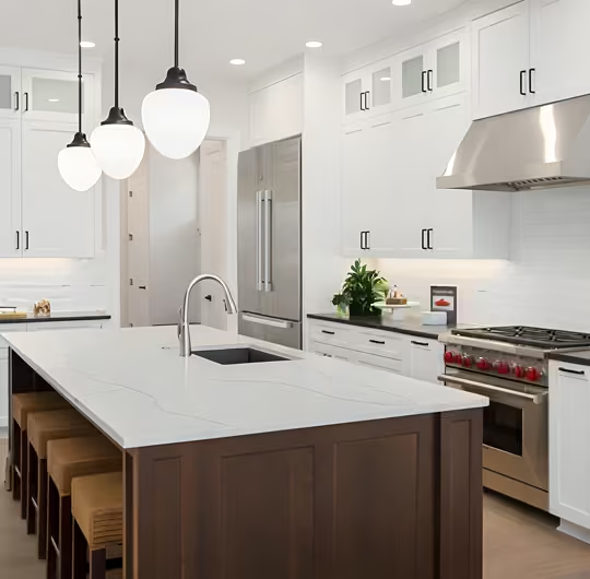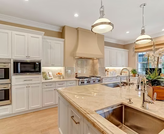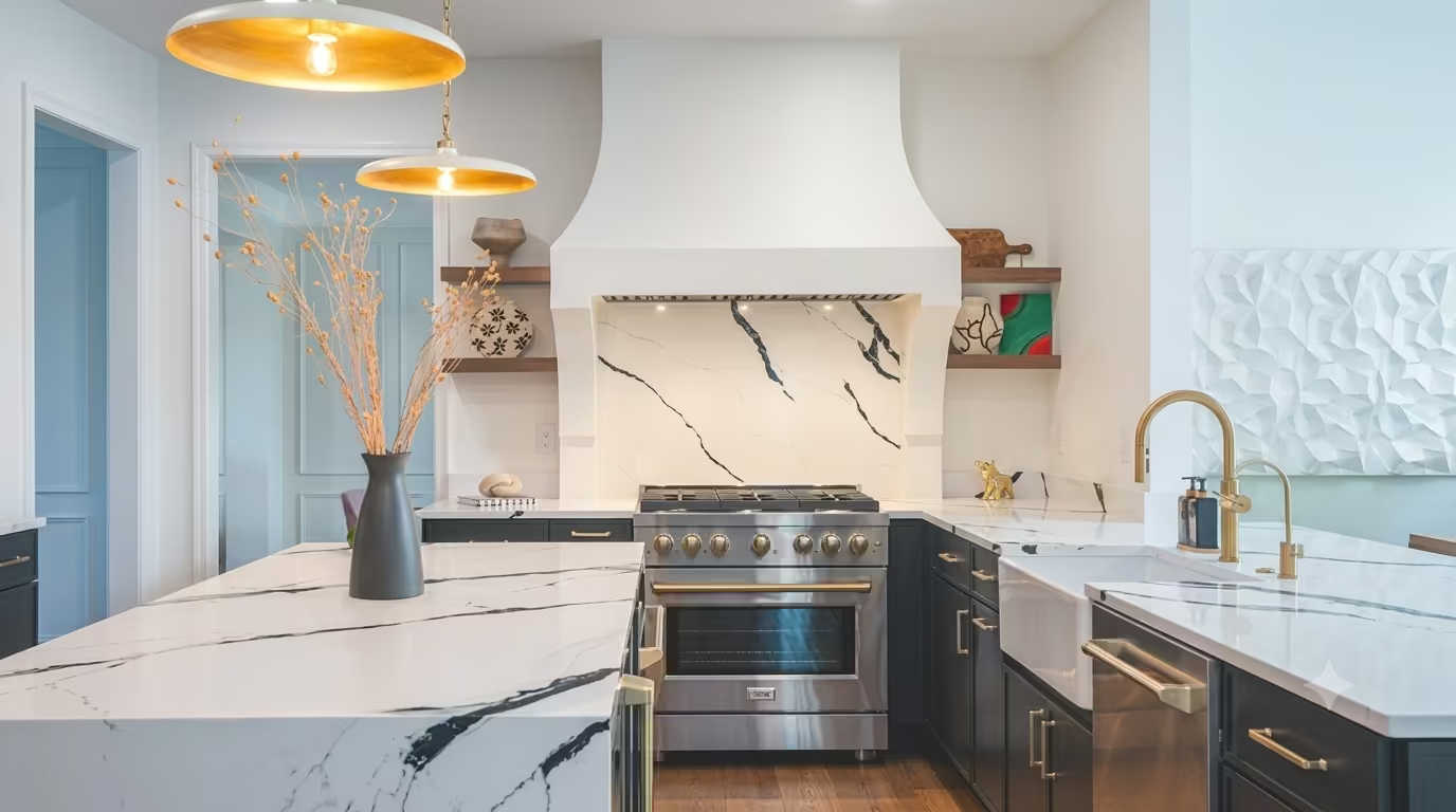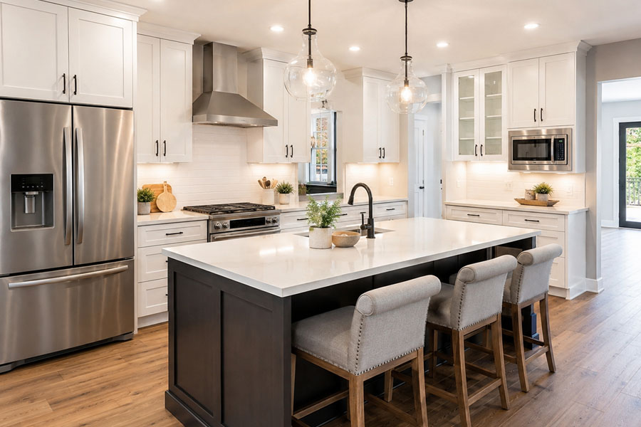
Neutral kitchens remain popular because they create a clean, adaptable foundation that works across design styles, from modern and contemporary to transitional and traditional. White, gray, beige, and soft wood tones help kitchens feel open, bright, and timeless.
However, relying only on neutral tones can sometimes make the space feel flat or lacking personality. Adding color in a thoughtful way helps create visual interest while preserving the flexibility that makes neutral kitchens appealing.
This article explains practical, effective ways to introduce color into a neutral kitchen while maintaining balance, cohesion, and long-term design value.
Why Neutral Kitchens Are a Popular Design Choice
Neutral kitchens offer several long-term advantages:
- They create a clean, uncluttered appearance.
- They reflect light, helping kitchens feel larger and brighter.
- They provide flexibility to change decor without major renovations.
- They appeal to a wide range of design preferences.
- They maintain strong resale appeal due to their timeless look.
Because neutral kitchens act as a blank canvas, they allow color to be introduced gradually and adjusted over time.
Key Principles for Adding Color to a Neutral Kitchen
Before introducing color, it is important to follow a few design principles:
1. Start with Small, Low-Commitment Elements: Introduce color through items that are easy to change, such as decor, textiles, or accessories.
2. Use One or Two Accent Colors: Limiting the color palette prevents the space from feeling cluttered or inconsistent.
3. Balance Warm and Cool Tones: Ensure new colors complement existing materials such as cabinets, countertops, and flooring.
4. Distribute Color Evenly: Avoid concentrating color in only one area. Spread accents across the room for balance.
Add Color Through an Accent Wall
An accent wall is one of the most effective ways to introduce color without overwhelming the space.
Popular accent wall options include:
- Soft blue or green for a calming effect.
- Deep navy or charcoal for contrast.
- Warm earth tones for a grounded look.
- Painted walls behind open shelving.
- Colored tile backsplashes.
Accent walls create a focal point while maintaining the overall neutral foundation.
Use Textiles to Introduce Color and Texture
Textiles are one of the simplest and most cost-effective ways to add color. Examples include:
- Area rugs
- Window treatments
- Seat cushions or bar stool covers
- Dish towels and potholders
- Fabric runners
Textiles also add softness and texture, which helps neutral kitchens feel more inviting.
Add Color Through Decor and Countertop Accessories
Kitchen counters provide natural opportunities to introduce color through functional items. Examples include:
- Ceramic bowls or vases
- Fresh fruit or plants
- Cookbooks with colorful covers
- Decorative trays
- Utensil holders
These elements can be easily updated to reflect seasonal or personal preferences.
Introduce Color Through Furniture and Seating
Furniture plays an important role in adding color, especially in open-concept kitchens. Consider adding:
- Colored bar stools
- Painted dining chairs
- Wood finishes with warm undertones
- Upholstered seating
Furniture helps create contrast while defining functional areas.
Incorporate Color Through Small Appliances
Small appliances can serve both functional and visual purposes. Examples include:
- Stand mixers
- Coffee machines
- Toasters
- Kettles
Choosing appliances in muted colors or subtle tones helps maintain balance while adding interest.
Add Color Through Cabinet Updates
Cabinets offer one of the largest surfaces in the kitchen, making them highly impactful. Options include:
- Painting lower cabinets in a contrasting color.
- Using two-tone cabinets.
- Adding colored island cabinets.
- Updating cabinet hardware for contrast.
For homeowners considering larger updates, cabinet changes are often part of broader kitchen remodeling projects.
Learn more about cabinet options and kitchen remodeling considerations.
Use Natural Elements to Add Subtle Color
Natural materials introduce organic color variations while maintaining a neutral aesthetic. Examples include:
- Indoor plants
- Wood finishes
- Stone materials
- Woven baskets
These elements add warmth and prevent the space from feeling sterile.
Consider Lighting as a Color Element
Lighting affects how colors appear in the kitchen. Options include:
- Pendant lights with colored finishes.
- Warm lighting to soften cool neutrals.
- Decorative fixtures with mixed materials.
Kitchen lighting can subtly enhance color without altering permanent features.
Color Placement Guide: Where to Add vs Avoid
| Area | Recommended for Color | Why |
| Accent wall | Yes | Creates focal point |
| Decor and accessories | Yes | Easy to update |
| Furniture | Yes | Adds contrast |
| Small appliances | Yes | Functional and flexible |
| Cabinets | Yes (selectively) | High visual impact |
| Large countertops | Use cautiously | Harder to change |
| Flooring | Use cautiously | Permanent element |
Common Mistakes to Avoid
- Adding too many colors at once.
- Using colors that clash with existing finishes.
- Ignoring lighting conditions.
- Making permanent changes before testing colors.
- Overloading countertops with decorative items.
Gradual changes allow better control over the final result.
When to Consider Larger Design Changes
If the kitchen feels outdated or lacks visual depth, larger updates may help create better balance. These may include:
- Updating cabinets.
- Changing backsplash materials.
- Improving lighting.
- Refinishing surfaces.
These changes are often part of broader kitchen renovation planning.
Final Thoughts
Neutral kitchens provide a strong design foundation, but thoughtful color additions help create depth, contrast, and personality. The most effective approach is to introduce color gradually through flexible elements such as decor, textiles, furniture, and selective cabinet updates.
By maintaining balance and choosing complementary tones, homeowners can enhance visual interest while preserving the timeless appeal of a neutral kitchen.
FAQs
- Blue
- Green
- Warm earth tones
- Soft pastels
- Muted darker tones like navy or charcoal
These colors complement neutral foundations without overwhelming the space.